How can we help you?
Most agencies chase noise. We build brands that last.
By balancing reach with resonance, we create desire at scale. The result is work that performs because it connects.
Give us a shout by filling out the form.
You can expect a response within two business days.
"*" indicates required fields
What are you looking for?
5 fundamental principles for building a great website for all users
When building or optimizing a website, it is easy to get distracted by the objectively exciting things — animation, unique interactions, innovative features — and forget to prioritize the fundamentals. Those interesting elements are valuable for crafting a delightful experience, but first and foremost, digital experiences must be accessible, functional, usable, memorable, and impactful in service of a strategic purpose.
You don’t want to develop cool website features just because you can. As the saying goes, just because you can, doesn’t mean you should.
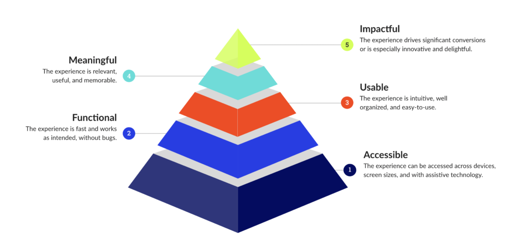
We’ve built a simple framework that keeps us strategic in our decision-making and prioritization as we build and optimize websites — or landing pages, or any other digital experience, for that matter. You’ll likely recognize the format, as it is modeled after Maslow’s hierarchy of needs, which posits that people’s basic needs must be met before they’re motivated to fulfill more advanced needs.

A website should be accessible
A digital experience qualifies as accessible when anyone, even people with disabilities, can use it. That means it is designed and coded to be accessed across varied devices and screen sizes, as well as with assistive technology.
Through its Web Accessibility Initiative (WAI), the World Wide Web Consortium (W3C) publishes the Web Content Accessibility Guidelines (WCAG), which outline accessibility requirements that range in fidelity from A to AAA, with AAA being the most stringent.
We aim to meet WCAG 2.2 level AA compliance standards on all of the digital experiences we own, build, or optimize.
Why does a website need to be accessible?
WCAG compliance standards ensure that users with visual impairments or disabilities, including situational or temporary disabilities, are still able to engage with the experience. The most amazing digital experience is worthless if it can’t be accessed by all users.
Creating accessible experiences is not only the moral thing to do, but it’s also good for business: It means more people can use your website.
How can you ensure your website is accessible?
- Scan the experience for WCAG violations using an accessibility reporting tool such as PowerMapper or UsableNet AQA.
- Test the experience across browsers and devices using a simulator such as BrowserStack.
- Fix all identified issues. This will take awhile, but it’s a marathon, not a sprint. The issues didn’t arise overnight, and you won’t be able to fix them overnight.
A website should be functional
An experience qualifies as functional when it is fast and works as intended, without bugs.
When it comes to website speed, milliseconds matter. Data indicates that 40% of users are likely to abandon the experience completely if they have to wait longer than three seconds for it to load.
As for those bugs, they not only prevent users from taking important actions in the moment, but technical glitches can also damage users’ perceptions of the brand due to lack of trust or credibility.
Why does a website need to be functional?
Your website hinders your business if users are unable to take the actions you want them to, such as filling out a lead form or making a purchase. Ensure the path is clear for your users to complete these critical tasks.
With short attention spans, users have no patience for slow or broken websites. Plus, conversion rates are categorically higher on faster websites.
How can you ensure your website is functional?
- Run a test with Google’s PageSpeed Insights tool.
- Implement an automated image optimization tool such as Kraken.io or the many others out there.
- Systematically work through page speed opportunities to improve the overall site speed.
- Leverage the expertise of a quality assurance (QA) analyst to review the site and identify bugs — then go fix them!
A website should be usable
An experience qualifies as usable when it is intuitive, well organized, and easy to use.
When making decisions about usability, be a pragmatist. In most cases, it’s best to follow common design patterns for key functional aspects of the experience, such as navigation, content feeds, search, filtering, and forms. If you’re going to deviate from those patterns, do so intentionally, and consider running an A/B test with users before implementing.
To ensure an experience is well organized, think critically — and conduct research, such as a card sort, if you can — about how content is grouped, labeled, and displayed. Use simple and familiar terms for content labeling. Choose scannable font styles with a clear visual hierarchy, as they are friendlier for users.
Why does a website need to be usable?
If users are confused or overwhelmed by an experience, they will bounce. Additionally, familiar labels and content taxonomies help users find what they are looking for quickly and easily, which means they are more likely to perform desired actions, continue to engage, or leave with a positive impression of the brand.
How can you ensure your website is usable?
- Talk to users. Recruit users who match your target audience and interview them, moderate a usability test, or run a survey.
- Audit the experience from a usability heuristic perspective.
- Learn about best-in-class usability patterns.
- Examine content organization and categorization.
- Outline recommendations and research and testing ideas.
- Prioritize recommendations in a road map.
- Incrementally optimize the digital experience by tackling items in your road map over time.
A website should be meaningful
An experience qualifies as meaningful when it is relevant, useful, and memorable.
Your website content should effectively explain your product or service and why your brand is uniquely positioned to provide high value to a potential customer. Prioritize user needs and expectations when constructing these messages, because the value conveyed is only worthwhile when it aligns with the user’s need state.
Why does a website need to be meaningful?
Delivering immediate value to users within an experience fosters engagement and affinity. Good content is, in and of itself, a way to deliver that value.
Beyond engagement and affinity, strategic content, when created with users and their buying journey in mind, has the potential to generate more organic traffic over time, leading to greater exposure for your brand.
How can you ensure your website is meaningful?
- Use the “who, what, when, where, why, and how” framework to pressure test an experience. Does the content speak to each of these in a relevant way?
- Identify “dead ends” within the experience. How might a user be guided to a relevant action or message from there?
- Take a user-first approach to writing and editing content, which should demonstrate that you understand your customers’ needs and that your brand is uniquely qualified to meet them. But don’t be wordy! Keep it simple, concise, and direct.
A website should be impactful
An experience qualifies as impactful when it drives significant conversions or is especially innovative and delightful.
Features or functions that influence conversions — and, ultimately, your bottom line — are critical from a business perspective, whether the conversion is a value exchange with users for data (such as a lead) or a clear-cut e-commerce transaction.
Special animations or interactions can be impactful from a brand or experiential perspective, as they create extra-special micro-moments with users. Just remember: These features should serve as intentional extensions of the brand experience, not as something cool for coolness’ sake.
Why does a website need to be impactful?
You like money, right? How about data? Aiming for a high volume of quality conversions is a no-brainer.
In addition, an impactful digital experience can help your brand stand out from the competition — and stick in the minds of users.
How can you ensure your website is impactful?
- Digital patterns have become patterns for a reason. Stick to them around 80% of the time.
- Identify one or two special features to invest in for the digital experience. This might be an interactive map or animation as a user scrolls down.
- Never go overboard with animation or interactivity. Too much can overwhelm and diminish the impact of those features as a whole.
- Track performance and pinpoint opportunities to improve. A/B test at a regular cadence.
This hierarchy-of-needs framework is intended to help ensure digital experiences deliver value across every facet, for both businesses and their users. No brand asset works harder for you than your website, so you might as well invest in doing it right.
5 fundamental principles for building a great website for all users
When building or optimizing a website, it is easy to get distracted by the objectively exciting things — animation, unique interactions, innovative features — and forget to prioritize the fundamentals. Those interesting elements are valuable for crafting a delightful experience, but first and foremost, digital experiences must be accessible, functional, usable, memorable, and impactful in service of a strategic purpose.
You don’t want to develop cool website features just because you can. As the saying goes, just because you can, doesn’t mean you should.
We’ve built a simple framework that keeps us strategic in our decision-making and prioritization as we build and optimize websites — or landing pages, or any other digital experience, for that matter. You’ll likely recognize the format, as it is modeled after Maslow’s hierarchy of needs, which posits that people’s basic needs must be met before they’re motivated to fulfill more advanced needs.

A website should be accessible
A digital experience qualifies as accessible when anyone, even people with disabilities, can use it. That means it is designed and coded to be accessed across varied devices and screen sizes, as well as with assistive technology.
Through its Web Accessibility Initiative (WAI), the World Wide Web Consortium (W3C) publishes the Web Content Accessibility Guidelines (WCAG), which outline accessibility requirements that range in fidelity from A to AAA, with AAA being the most stringent.
We aim to meet WCAG 2.2 level AA compliance standards on all of the digital experiences we own, build, or optimize.
Why does a website need to be accessible?
WCAG compliance standards ensure that users with visual impairments or disabilities, including situational or temporary disabilities, are still able to engage with the experience. The most amazing digital experience is worthless if it can’t be accessed by all users.
Creating accessible experiences is not only the moral thing to do, but it’s also good for business: It means more people can use your website.
How can you ensure your website is accessible?
- Scan the experience for WCAG violations using an accessibility reporting tool such as PowerMapper or UsableNet AQA.
- Test the experience across browsers and devices using a simulator such as BrowserStack.
- Fix all identified issues. This will take awhile, but it’s a marathon, not a sprint. The issues didn’t arise overnight, and you won’t be able to fix them overnight.
A website should be functional
An experience qualifies as functional when it is fast and works as intended, without bugs.
When it comes to website speed, milliseconds matter. Data indicates that 40% of users are likely to abandon the experience completely if they have to wait longer than three seconds for it to load.
As for those bugs, they not only prevent users from taking important actions in the moment, but technical glitches can also damage users’ perceptions of the brand due to lack of trust or credibility.
Why does a website need to be functional?
Your website hinders your business if users are unable to take the actions you want them to, such as filling out a lead form or making a purchase. Ensure the path is clear for your users to complete these critical tasks.
With short attention spans, users have no patience for slow or broken websites. Plus, conversion rates are categorically higher on faster websites.
How can you ensure your website is functional?
- Run a test with Google’s PageSpeed Insights tool.
- Implement an automated image optimization tool such as Kraken.io or the many others out there.
- Systematically work through page speed opportunities to improve the overall site speed.
- Leverage the expertise of a quality assurance (QA) analyst to review the site and identify bugs — then go fix them!
A website should be usable
An experience qualifies as usable when it is intuitive, well organized, and easy to use.
When making decisions about usability, be a pragmatist. In most cases, it’s best to follow common design patterns for key functional aspects of the experience, such as navigation, content feeds, search, filtering, and forms. If you’re going to deviate from those patterns, do so intentionally, and consider running an A/B test with users before implementing.
To ensure an experience is well organized, think critically — and conduct research, such as a card sort, if you can — about how content is grouped, labeled, and displayed. Use simple and familiar terms for content labeling. Choose scannable font styles with a clear visual hierarchy, as they are friendlier for users.
Why does a website need to be usable?
If users are confused or overwhelmed by an experience, they will bounce. Additionally, familiar labels and content taxonomies help users find what they are looking for quickly and easily, which means they are more likely to perform desired actions, continue to engage, or leave with a positive impression of the brand.
How can you ensure your website is usable?
- Talk to users. Recruit users who match your target audience and interview them, moderate a usability test, or run a survey.
- Audit the experience from a usability heuristic perspective.
- Learn about best-in-class usability patterns.
- Examine content organization and categorization.
- Outline recommendations and research and testing ideas.
- Prioritize recommendations in a road map.
- Incrementally optimize the digital experience by tackling items in your road map over time.
A website should be meaningful
An experience qualifies as meaningful when it is relevant, useful, and memorable.
Your website content should effectively explain your product or service and why your brand is uniquely positioned to provide high value to a potential customer. Prioritize user needs and expectations when constructing these messages, because the value conveyed is only worthwhile when it aligns with the user’s need state.
Why does a website need to be meaningful?
Delivering immediate value to users within an experience fosters engagement and affinity. Good content is, in and of itself, a way to deliver that value.
Beyond engagement and affinity, strategic content, when created with users and their buying journey in mind, has the potential to generate more organic traffic over time, leading to greater exposure for your brand.
How can you ensure your website is meaningful?
- Use the “who, what, when, where, why, and how” framework to pressure test an experience. Does the content speak to each of these in a relevant way?
- Identify “dead ends” within the experience. How might a user be guided to a relevant action or message from there?
- Take a user-first approach to writing and editing content, which should demonstrate that you understand your customers’ needs and that your brand is uniquely qualified to meet them. But don’t be wordy! Keep it simple, concise, and direct.
A website should be impactful
An experience qualifies as impactful when it drives significant conversions or is especially innovative and delightful.
Features or functions that influence conversions — and, ultimately, your bottom line — are critical from a business perspective, whether the conversion is a value exchange with users for data (such as a lead) or a clear-cut e-commerce transaction.
Special animations or interactions can be impactful from a brand or experiential perspective, as they create extra-special micro-moments with users. Just remember: These features should serve as intentional extensions of the brand experience, not as something cool for coolness’ sake.
Why does a website need to be impactful?
You like money, right? How about data? Aiming for a high volume of quality conversions is a no-brainer.
In addition, an impactful digital experience can help your brand stand out from the competition — and stick in the minds of users.
How can you ensure your website is impactful?
- Digital patterns have become patterns for a reason. Stick to them around 80% of the time.
- Identify one or two special features to invest in for the digital experience. This might be an interactive map or animation as a user scrolls down.
- Never go overboard with animation or interactivity. Too much can overwhelm and diminish the impact of those features as a whole.
- Track performance and pinpoint opportunities to improve. A/B test at a regular cadence.
This hierarchy-of-needs framework is intended to help ensure digital experiences deliver value across every facet, for both businesses and their users. No brand asset works harder for you than your website, so you might as well invest in doing it right.


